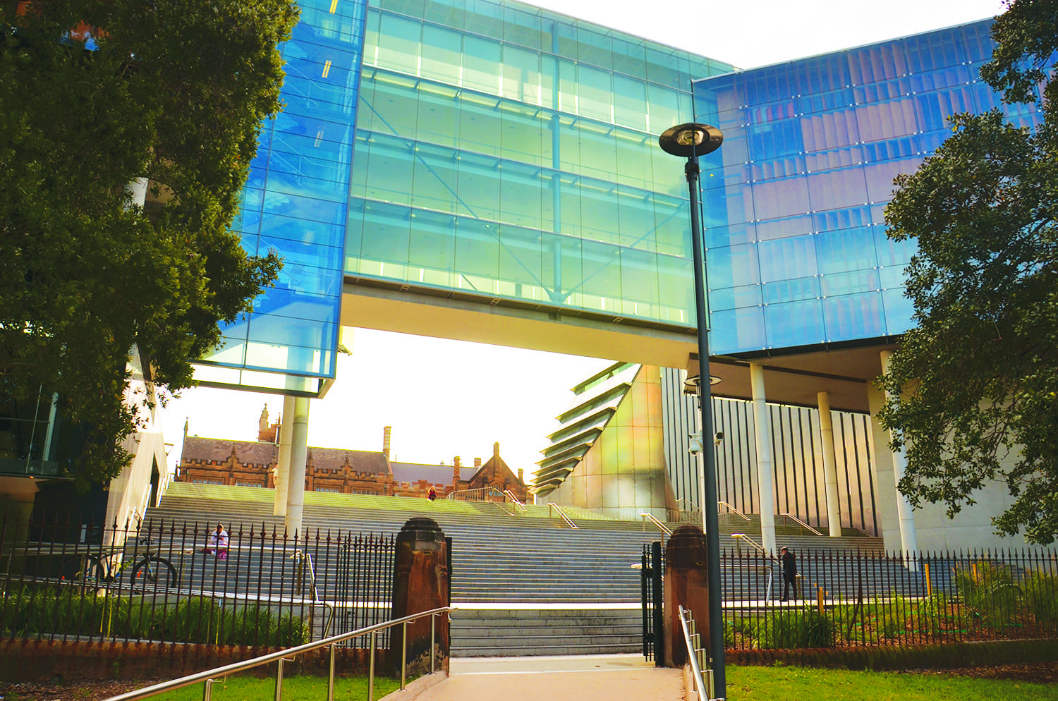
You are immediately hit with a sense of grandeur upon first sighting the University of Sydney’s New Law School. An expanse of green, geometric lawns sprawls out from the thoroughfare of Eastern Avenue to reveal a multi-levelled glass bridge, flanked on both ends by what appear to be stacks of orange shipping containers. All of it is seemingly suspended midair, frozen somehow in a state of perfect stasis. Cast your gaze below this floating glass prism and you see a lush window of Victoria Park. Cast your gaze above, and you see the Sydney skyline sparkling in the distance through the glass, tinted blue by the sky. In front of it all, rising from the lawns and into the sky, is a gracefully arched silver tower, its steel shell reflecting the colour of its surroundings with a distinct, metallic sheen. It splices this vision of glass and grass like an alien spaceship that has crash-landed on campus. But before you can piece together how this silver tower fits in with the rest of the building, the illusion is broken. A group of builders in high-vis vests surround the tower, some on the ground and others hoisted in the air by a crane. Although a spectacular sight from afar, up close you realise that the building is very much under maintenance.
* * *
Completed in 2009 by Australian design studio Francis-Jones Morehen Thorp (fjmt), the New Law School building triumphantly asserted the presence of the Law School on the main campus. Previously, it had been located right at the heart of the Sydney CBD, directly across the Federal and High Court in a 16-storey building which featured a games room and two squash courts. During the move to the main campus, the then dean of the school Gillian Triggs, while somewhat reserved in her praise for the building (prefacing it with her belief that law “could be taught in a barn”) wrote that the new building presented an “unprecedented opportunity to offer legal education for contemporary global legal practice.” In the end, fjmt’s design beat out over 40 other entries in an international design competition. With its glass panes and timber blinds, it was celebrated by the wider architectural community with a whole suite of awards, cementing its success at “redefining and reinterpreting the architectural dialectic between city and campus,” as fjmt had said it would.
So it would be a surprise, then, to learn that a decade since its completion, the Law Building is being used as a very different type of pedagogical tool — in a first year architectural technologies unit as a case-study about what not to do when designing a building.
When approached for an interview, Michael Muir, the coordinator of the unit, was initially hesitant to criticise the building, writing in an email that it was an ambitious project, and that aiming high means you have further to fall.
“They had a red hot go. Architecture is a tough business,” he concluded.
However, in person, Muir is much more open about his thoughts on the New Law Building. While he praises it for its presence on Eastern Avenue, he very quickly gets to one of the building’s main problems — the heat.
“It’s a long thin building facing east and west, and what happens in any building facing west is that you get a lot of sun in the afternoon. It might be 35 degrees and then you get six to seven hours of sun. It just gets hammered.” Indeed, anyone who has tried to use the foyers in the building to enjoy a sunny day will quickly find themselves in something resembling a greenhouse. No matter how stunning the views are, of the city skyline or the campus sandstones, most eventually give up and retreat to the dreary confines of the law library below, defeated by the harsh sunlight that makes viewing their laptop screens almost impossible.
In many ways, fjmt had anticipated this problem, which would have been obvious the moment they saw the topography of the site. They encoded a solution into the design through a system of timber louvres, which give the building its signature “shipping container” look. These adjustable blinds “block out the harsh glare and heat of the low eastern and western sun while preserving and directing views when seated within,” fjmt wrote. However, although Muir commends the louvres for the beautiful contrast they create with the glass, he says that the system is ultimately for nought as the glass itself is not protected with other materials.
Less obvious than the external structure of the building are the problems emanating from its internal ventilation system. Originally, fjmt had proposed a design that would “draw in and control natural air circulating through and around the interior, tempering the environment to cool and heat as necessary.” They intended to do so through glass pane windows which, like the louvres, could be slanted open, creating two separate openings — one on the top and one on the bottom. The idea was for cool air to go into each floor from the bottom opening, and then leave from the top. However, Muir points out many problems with this system — the first being that air simply doesn’t move in the way the model supposes it to. Inherent in the design is a confidence that the air, brought in by wind, will leave a room from the same side it entered. However, in the absence of any cross-ventilation, air just doesn’t turn 180 degrees by itself.
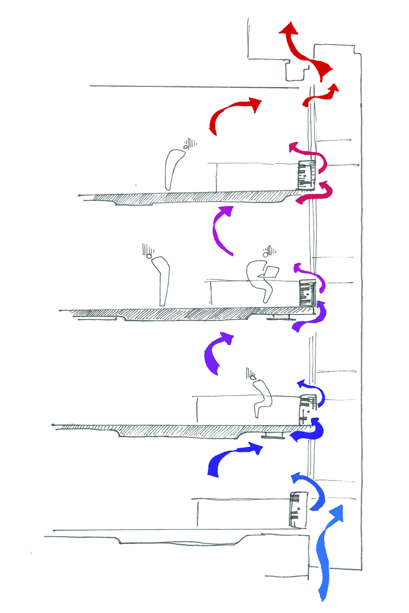
“I use that as an example to try and convince students that the air moves like water. You don’t see water go into a room and go back out again, it flows!” he says.
Combined with the small size of the openings in the windows, Muir says that only a tiny amount of air ever leaves each floor. But even if there was a way to redirect a sizeable amount of air out the same side from which it came, the ventilation system still wouldn’t work. Muir explains that the assumption that cool air enters each floor is illogical. As the model itself supposes, hot air leaves each floor from the top. The problem is, when hot air leaves the top of each floor, it doesn’t just disappear, but wafts into the floor above through the bottom opening of the window. So the air that enters the next floor is slightly hotter than the stream of air that entered the floor below. Accordingly, by the time the air ascends to the top floor, it carries three storeys worth of heat generated by human activity and sun
“A lot of air conditioning had to be retrofitted into that top floor… it became really clear soon after the completion that it was completely uninhabitable,” Muir adds.
Law students might see similarities between this current fact scenario and a revision problem question for Torts and Contract II set out in the unit outline. Originally from the 2015 final exam, the question describes a contract between a building company and a health care enterprise for a new hospital which promises “ventilating shafts to enable the circulation of air and the escape of hot air, drawing in cool air from a series of underground tunnels.” Unfortunately, in the first summer after construction is completed, temperatures soar in the top floor, making it unusable, meaning they have to spend an additional $200,000 on air conditioning.
In an email, Barbara McDonald, a professor at the Sydney Law School, confirms both that air conditioning had to be retrofitted, and also that the Law School has drawn inspiration from the whole situation for exam questions. However, McDonald is wary of placing all the blame on the architects.
“Many defects might arise out of the construction and maintenance of the building, or budget driven alterations to the design, rather than the original design itself.”
Indeed, looking at who ultimately bore the costs suggests that the builders were more culpable than the architects. While the original builder, Baulderstone, was acquired by Lead Lease in 2013, a university spokesperson stated that the latter agreed to inherit and accept all liability for the repairs.
Muir, however, says that the problem of liability is probably more complex than what the resolution implies.
“There would be two sides to the story. One side would be the builders saying it wasn’t worked out properly, the other side would be the architects saying the builders didn’t do it properly.”
One particular sore point for the builders, he points out, came from the sheer complexity of the building’s facades. While the building looks like a floating rectangular prism on first glance (or prima facie, as law students would say), walking around it reveals that it has much more than six sides and is more of a collection of prisms stuck together than a single box. In contrast to the neighbouring Fisher Library, which is a proper rectangular box whose sides are largely the same, Muir estimates that there are more than 20 different sides to the law building despite it only being six storeys tall, and that many of these sides would have required different treatments and techniques to build.
“There’s nothing a builder likes more than doing one thing five hundred times over and over. Five hundred things once is a bit of a worry.”

However, looking at the other competition designs, it seems that the builders would have had a hard time building the Law School regardless of which architects had been chosen. One of the other proposed designs featured sports stadium-like structures with a courtyard garden in the middle. Another showcased two buildings which, like continents torn apart by tectonic movements, are separated from each other to reveal a large forecourt in the rift. McDonald, who was on the six-person panel that chose the winning design, said that she strongly believed fjmt presented the best design, as it had been the only one that made use of the sloping site, and fulfilled the University’s desire to open up the main campus to Victoria Park.
She is, of course, referring to the spatial opening and stairs underneath the suspended glass structure. Hailed with almost messianic terms in fjmt’s design statement as a “new entry to the university, with the splintered form fragments above, extending wide like an open door or hand that gestures invitation,” there is indeed an alluring, sylvan intimacy of having Victoria Park so open to Eastern Avenue. A window in this corridor of buildings, students are presented with a calming, verdant vista of a different world, one where exams and readings can be swapped for a picnic blanket and a book you actually want to read. Tempted by it all, you walk down the grand set of stairs, under the glass bridge, and into the park… only to be greeted by a rusted fence that obstructs you from a lunchtime spent under the shade of ancient fig trees.
That is, of course, if that scenario had played out before 2018. There is now a welcoming pause in the boundary fence thanks to a newly opened gate, guarded on each end by sandstone pillars relocated from City Road. But before it was built, students would have been greeted with a massive, architectural anti-climax where the park would be highly visible, but completely inaccessible. Original plans of the building show two gravel paths which join the campus with the park, but according to a University spokesperson, this was never officially endorsed. The reasons why are unclear. While a conservation report released by the University in 2002 did identify that the fence was situated in a sensitive site with regards to Indigenous archeology, it concluded after an inspection that any deposits would have been too disturbed by past constructions of roadways and parking lots to be intact. Muir believes the architects simply never received council approval for it, but adds that the building makes much more sense now that a gate exists.
Moving inside the building, you are greeted by another set of problems. In some classrooms, tutorials are accompanied by the incessant dripping of leaking water, while in others, law students are transported back to the frenzied nights they spent in dark European nightclubs on exchange because they quite literally smell of smoke. Ironically, beside the moot courts, the most pedagogical part of the building’s interior seems to be the litany of potential torts waiting to happen. Sure, they’d probably injure a student, but they’d also give them a valuable real-world demo of what they study in class. For example, back in 2016, a sizeable part of the building was fenced off due to fears that parts of the ceiling would fall onto a student.
At the heart of the building is the Turnbull Foundation Reading Room located in the library. Some affectionately call it “Daddy’s reading room,” others spitefully “the cone of shame.” While deeply polarising, this space holds an almost mythologised position in the culture of the Sydney Law School, so much so that you can almost glean what people think about their law degree based on what they think of it.
“It’s nice and tranquil,” one student says.
“It’s oppressively silent,” another retorts.
Likewise, McDonald is a big fan of it, but Muir says it was a missed opportunity.
“It’s a lot of work for just 20 people to sit in.” he says.
Walking inside, you can’t deny how spectacular the spire’s pristine white walls and cathedral-tall ceilings are when sunlight pours in from the huge skylight. Unfortunately, light is not the only thing that pours in, and the reading room is plagued by perennial leakage problems that seem to arise every time it rains. So bad is the problem that it seems to have been shut off from use since the start of this year.

* * *
Despite the painstaking efforts fjmt went about to create a “collegiate place of learning” that would be “open, inviting, responsive and supportive,” their control in fostering such a space stopped with the building’s completion. While they can shape our experience through manipulating design elements, students and staff ultimately determine how the building is experienced, and the place it holds in campus culture. Former Dean Gillian Triggs had hoped that the new building would allow the Law School to hold clinical units on campus, aimed at giving students the opportunity to provide pro-bono legal advice to marginalised members of the community, much like UNSW’s Kingsford Legal Centre. Unfortunately, this has not happened. While the school started offering social justice units in 2011, they are conducted at nearby legal centres rather than in the building itself.
Interestingly, in other ways, the building has been a victim of its own success. While McDonald is a great believer in the building’s merits, she bemoans that the glass foyers never became the indoor gathering space they were originally intended to be. Far from being caused by lighting and heating problems, McDonald says the sun-filled space was so popular with university administration as a venue space for events that it became constantly booked out, preventing students from using it and developing a culture around it.
“It usually looks like an airport lounge at 2am with no passengers. Empty, characterless and cold.”
Irregardless, she says the best feature of the design, one which compelled her to choose it, is that it pushed the learning spaces and library underground, opening up a huge expanse for the now famous law lawns, which has become a prominent watering hole for students. Muir says that the building’s leakage problems ultimately stem from it being underground, which complicates the waterproofing process, but agrees that the lawn is a very successful part of the building. Walking down Eastern Avenue on a sunny day, it seems law students agree. However, when asked whether he thought the architects were successful overall in realising their ambition, Muir pauses to think before smiling.
“If I look around the university, the best space is still the Quadrangle,” he says.
“However, it does a much better job than that weird thing on Eastern Avenue which has been recently built.”